If you are signing up to the forums, Thank you. You will need to activate your account by clicking a link in an email from the forums.
Anything fishing here including Tackle and Bait.
Simple
Site Admin
Posts: 12128 Joined: September 11th, 2006, 9:58 pmPersonal Text: flapjack nom nomLocation: Staffordshire
Contact:
#1
Unread post
by Simple February 5th, 2012, 1:00 pm
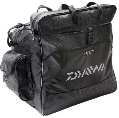
I personally hate the new 'Daiwa' logo so I will be keeping my old luggage..
The new logo is hard to read and looks daft on the Holdalls.
I also don't like the white piping, it looked better in red like on the old stuff.
Simple
Mugger
Marsh AC
Posts: 1853 Joined: January 16th, 2008, 8:35 pmPersonal Text: Happily retired.Location: Athersley, South YorkshireMatch Team/ Club: Maggotdrowning.com
Mugger
Drynet
Gathering Dust
Posts: 3742 Joined: November 22nd, 2007, 12:43 am
#3
Unread post
by Drynet February 5th, 2012, 2:23 pm
I agree with Si its shocking
Drynet
mburgess
Forum Stalker
Posts: 875 Joined: December 25th, 2007, 6:17 pmPersonal Text: BudgieLocation: cannock
#4
Unread post
by mburgess February 5th, 2012, 6:15 pm
mburgess
Drynet
Gathering Dust
Posts: 3742 Joined: November 22nd, 2007, 12:43 am
#5
Unread post
by Drynet February 5th, 2012, 6:59 pm
If i had the Airity pole i'd stick tape over the logo
Drynet
Simple
Site Admin
Posts: 12128 Joined: September 11th, 2006, 9:58 pmPersonal Text: flapjack nom nomLocation: Staffordshire
Contact:
#6
Unread post
by Simple February 5th, 2012, 7:46 pm
can't believe a logo design would effect what you buy if you like the product.
For me it would Mugger, sorry.
The logo is what sells the brand after all, you have to look twice at it to tell what it says. 'Diawa' is not the most common word in the world anyway, if someone who had been out of fishing for a while came back and saw it he would probably not know it was Diawa..
Looks like some kind of zebra brand
Simple
Dave C
Global Moderator
Posts: 3126 Joined: October 10th, 2006, 5:28 pmMatch Team/ Club: Marsh AC
#8
Unread post
by Dave C February 5th, 2012, 11:18 pm
if someone who had been out of fishing for a while came back and saw it he would probably not know it was Diawa..
Thats because the company name is DAIWA.
Dave C
Mugger
Marsh AC
Posts: 1853 Joined: January 16th, 2008, 8:35 pmPersonal Text: Happily retired.Location: Athersley, South YorkshireMatch Team/ Club: Maggotdrowning.com
Mugger
Geoff_E
Forum Ornament
Posts: 418 Joined: March 12th, 2010, 9:30 pm
#10
Unread post
by Geoff_E February 5th, 2012, 11:48 pm
Surely its the quality of the product that you pay for and not the way a logo looks on the side, or am I missing something?
Geoff_E
darkhorse
Junior Member
Posts: 72 Joined: November 6th, 2011, 12:50 pm
#11
Unread post
by darkhorse February 6th, 2012, 7:06 am
quality of products is most important, have to agree though that logo is hard to read, wouldn't stop me from buying if it was what i required
darkhorse
Simple
Site Admin
Posts: 12128 Joined: September 11th, 2006, 9:58 pmPersonal Text: flapjack nom nomLocation: Staffordshire
Contact:
#12
Unread post
by Simple February 6th, 2012, 9:26 am
Thats because the company name is DAIWA.
Thats what I mean Dave, look at it again and there is an extra bit after the D.
It is quality gear no doubt about that.
Simple